Elections and Infections
I wanted to see how the vaccination rates for Covid-19 compared to the election results by state. I pulled some data from the CDC as of August 13 2021 for the percent of people fully vaccinated. I pulled data from the FEC to show which candidate had the majority in each state. If you remember the post on Cartograms this may look familiar.
I primarily use GIS desktop software at work but there are plenty of tools suited for various platforms to manipulate and visualize data. D3.js is a javascript library specifically geared toward data visualisation. It has some useful tools and is flexible enough to be used with libraries like Leaflet.
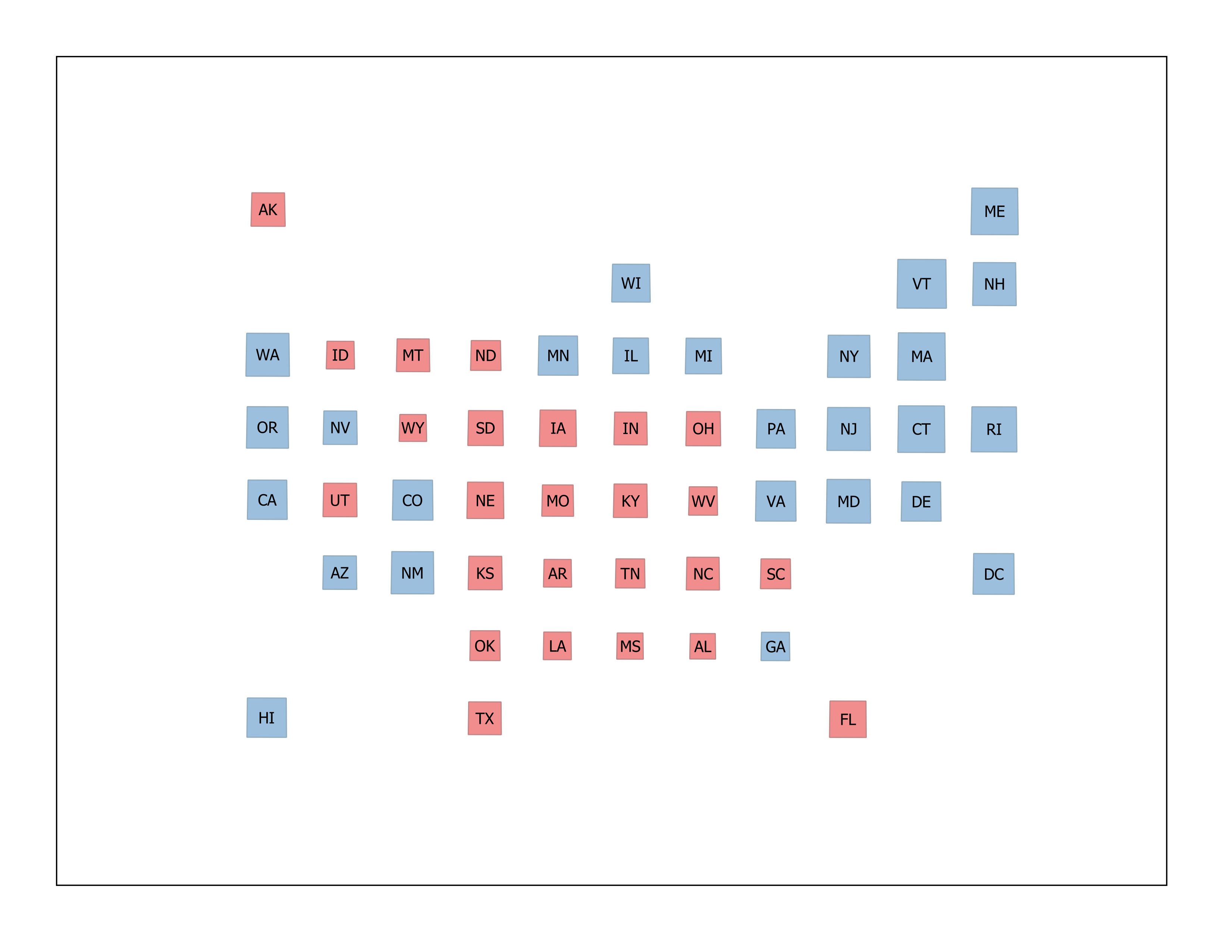
Here is a graphic showing the 2020 election results by candidate:
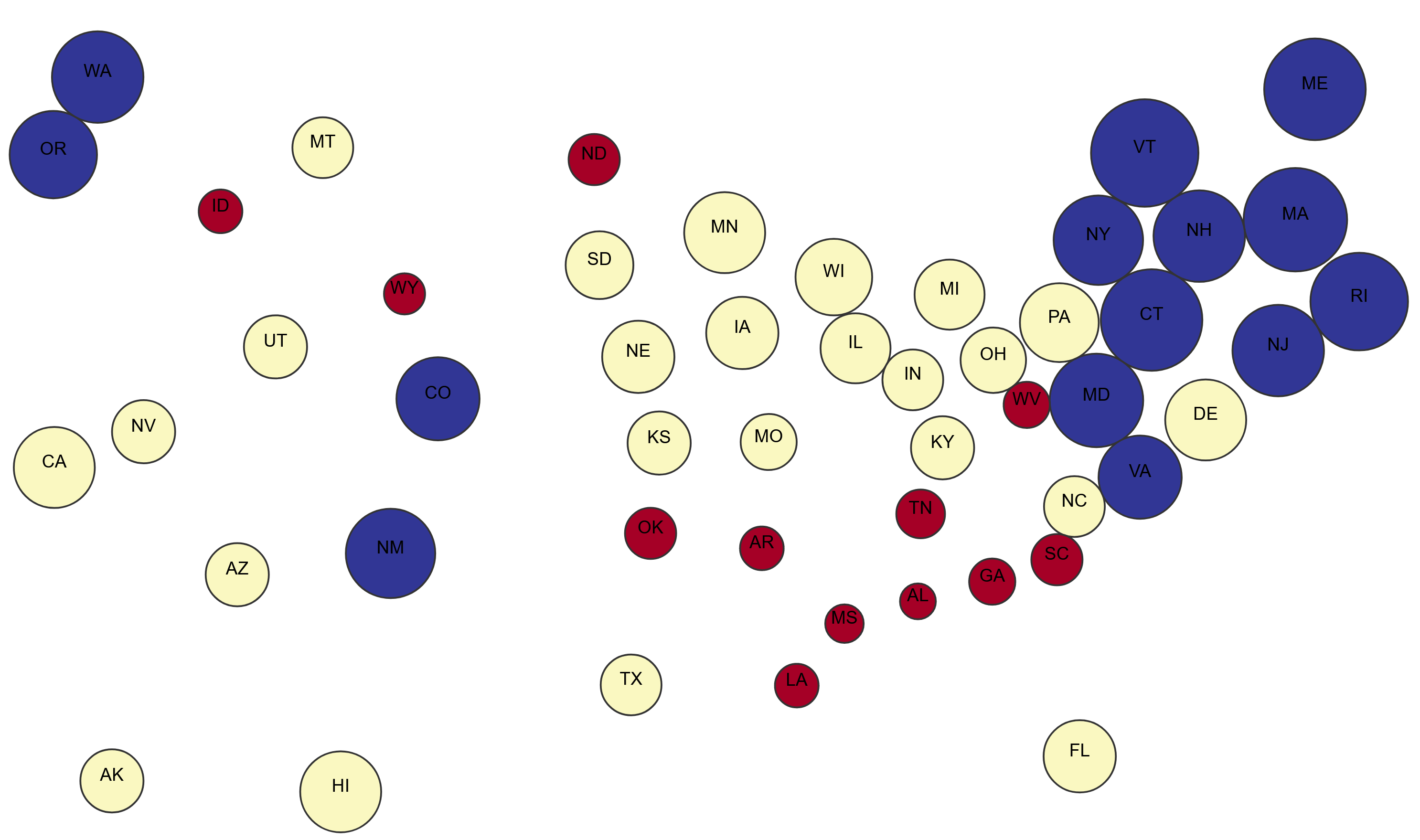
Dorling
Here is a dorling cartogram scaling each state based on the percentage of the population vaccinated as of August 13 2021.
Here is a non-contiguous cartogram from ObservableHQ that shows various vaccination rates from 2021.
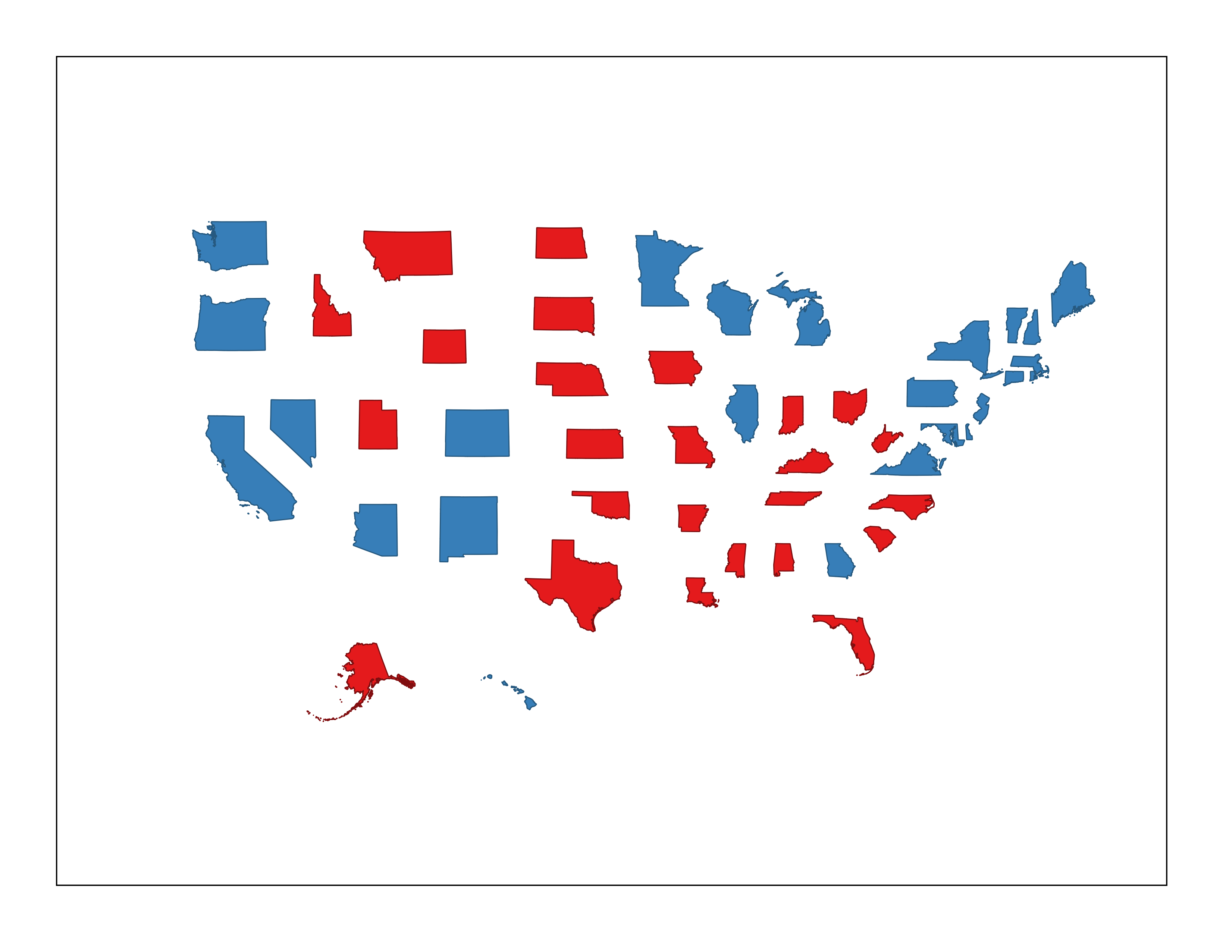
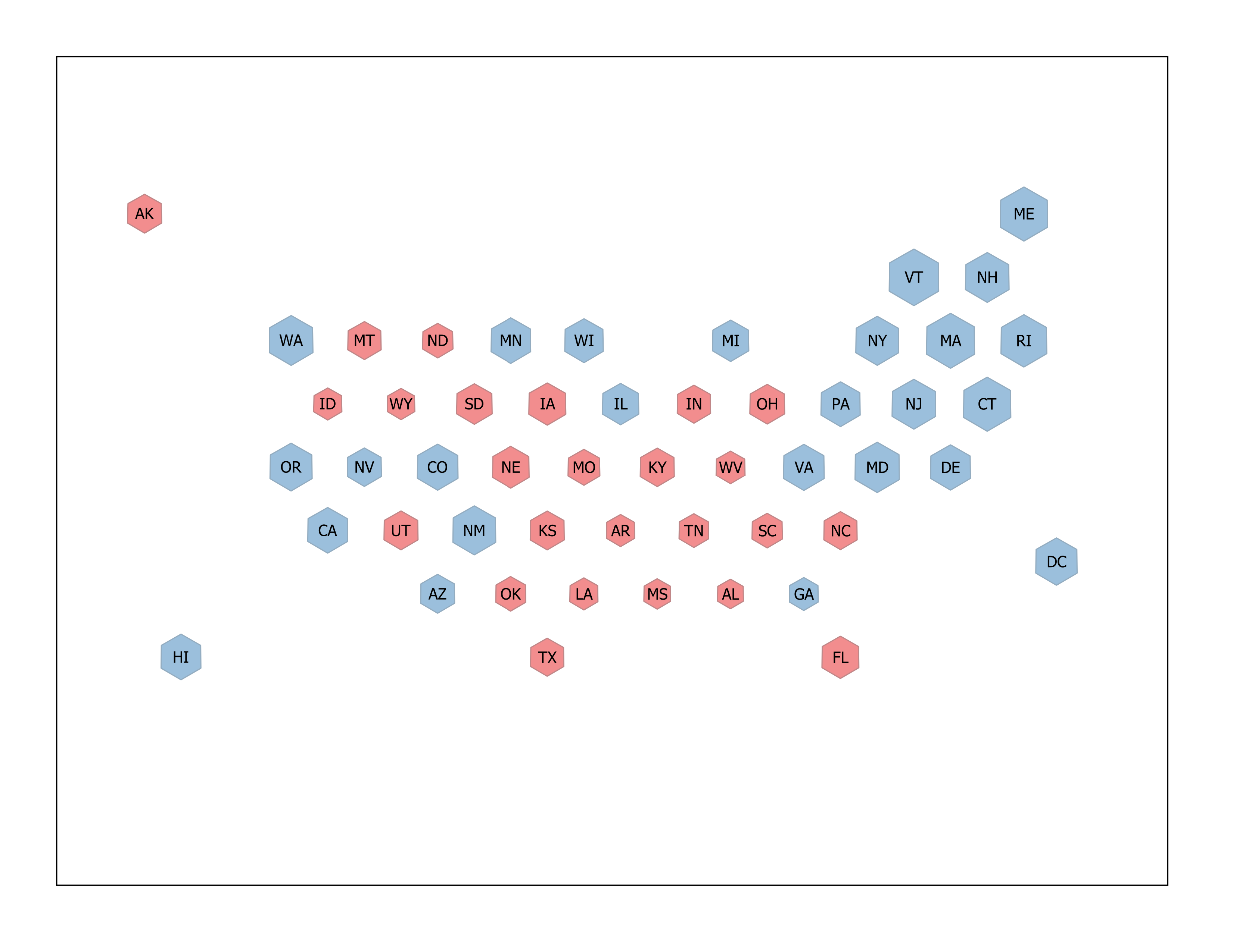
I also included some tradition exhibits generated in QGIS:
Contiguous
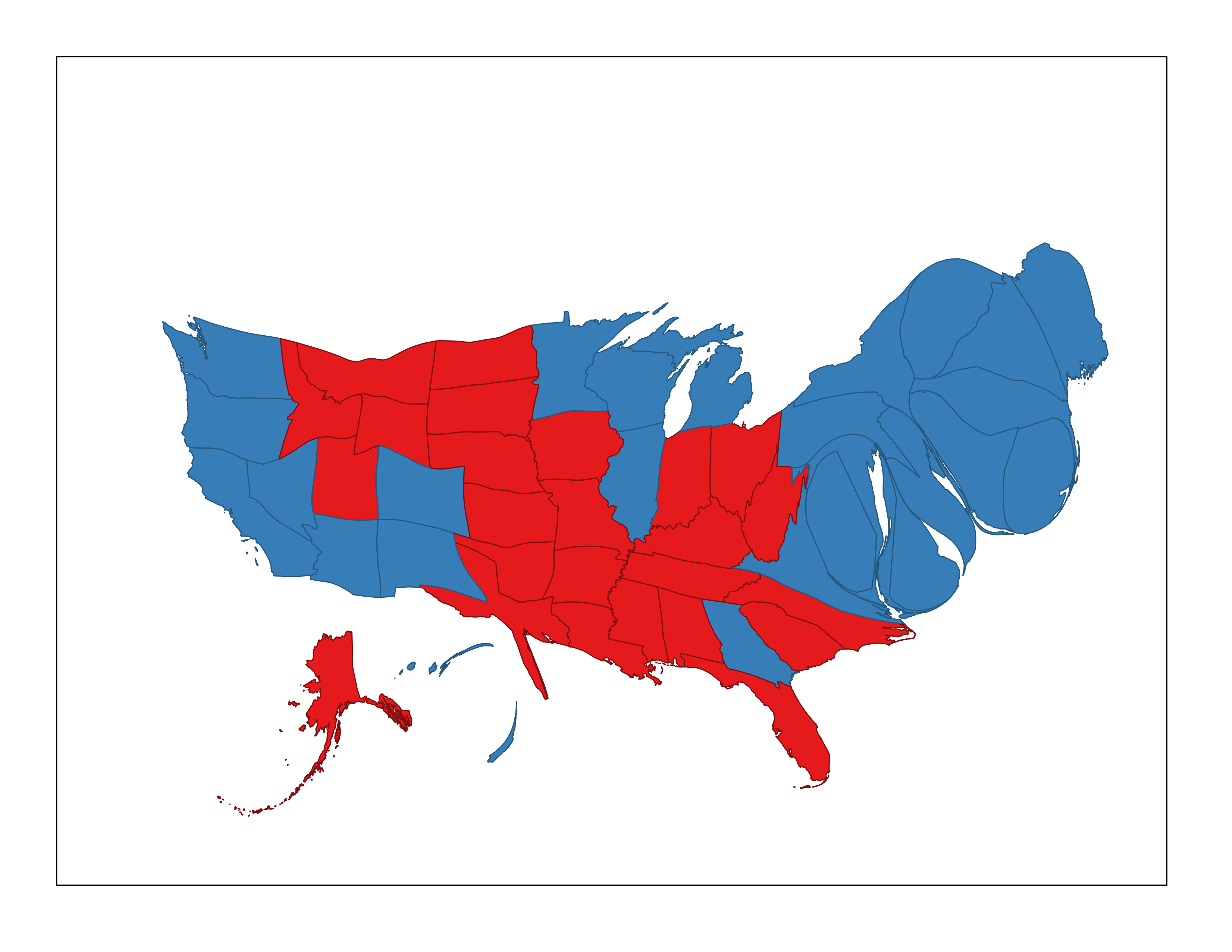
Non-Contiguous
Hexagon
Grid
A bivariate choropleth might be another good graphic to try in the future.
I won’t make any claims to the correlation or causation of the data, however here is an interesting article by the New York Times that goes more into depth on the relationship between vaccinations and political affiliation.