Cartograms
Election day is always a fun day to see how different organizations represent their data for the election. Historically they would just have a red and blue map of the United States but now there are all sorts of dashboards and near real time data streams that offer endless ways of manipulating and presenting the data.
Election Maps
Here are some examples different election maps I’ve pulled from the 2020 election:
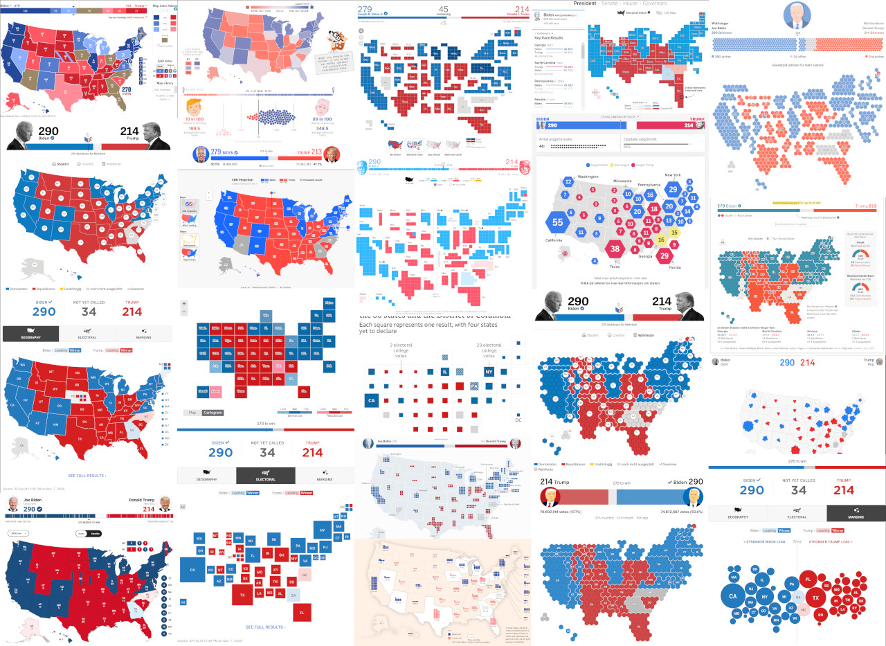
Sources for the images: 270 to win, Der Spiegel, NPR, FOX, ABC, PBS, NYT, NZZ, Aljazeera, IGFT, Le Monde, NRK, WSJ, Zeit, Bloomberg, CNN, BBC, 538
Representation
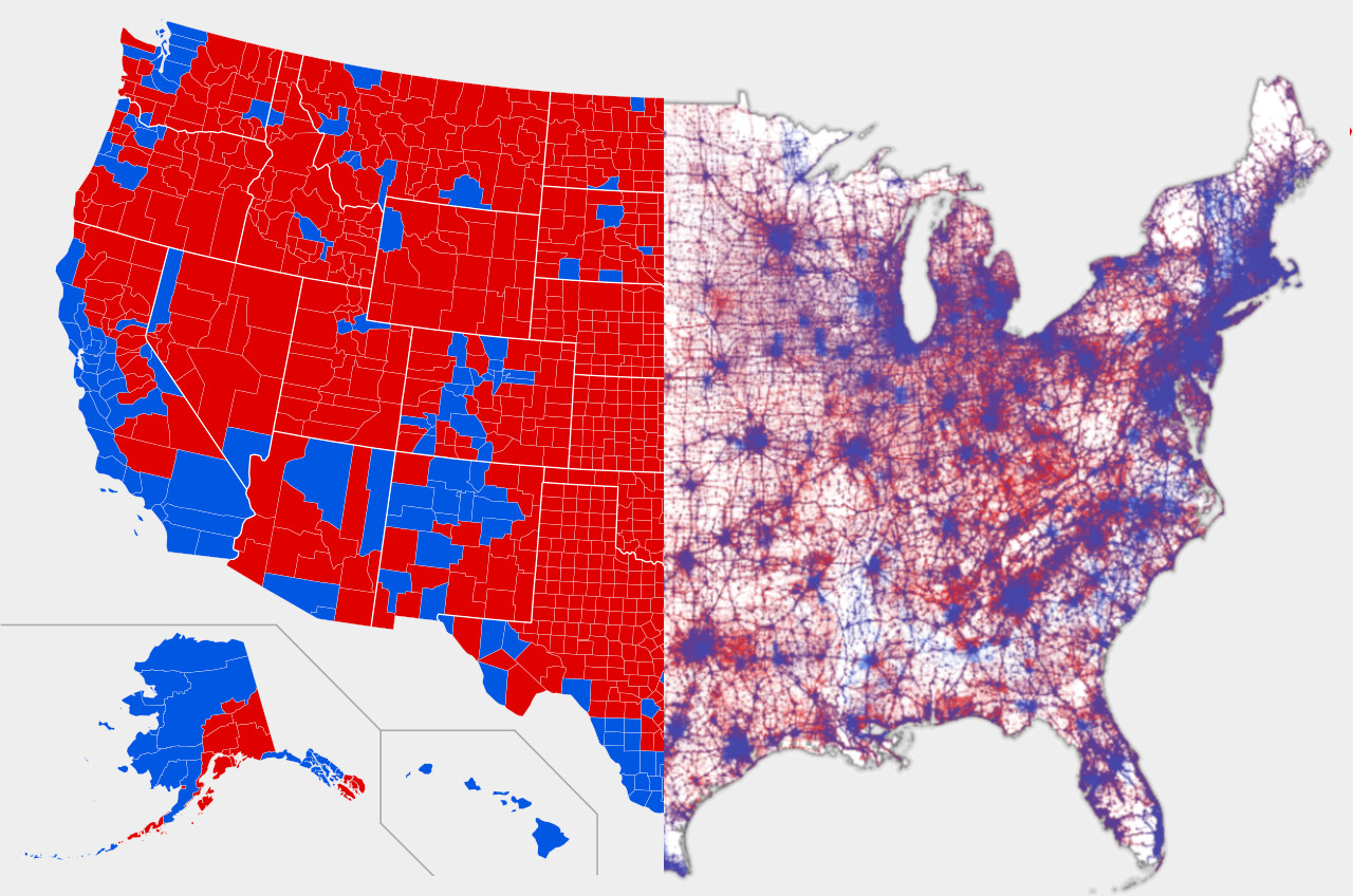
One popular election map that has shown up around the web posted by Trey Yingst on Twitter is a 2016 results map that was being hung up in the west wing of the White House.
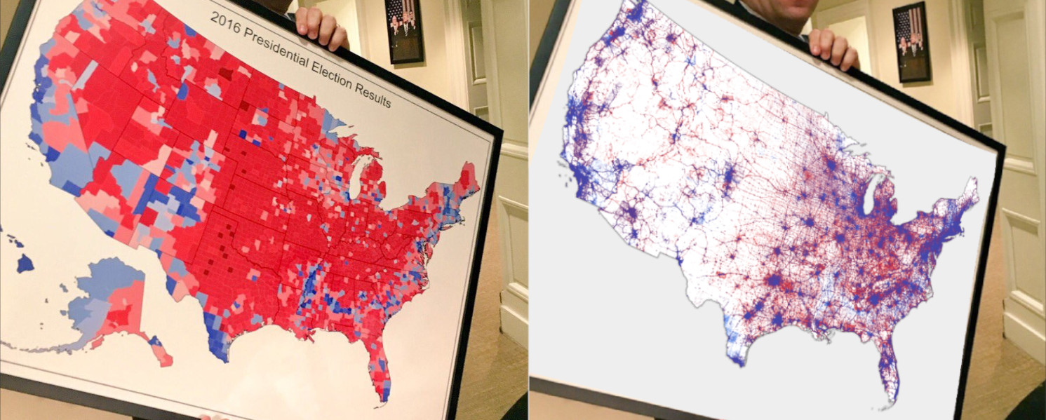
The map is overwhelmingly covered in red but the electoral votes were just 306 to 232 or 57% to 43% of the votes respectively. The percentage of red shown on the map is far more than just 57%. The adjoining pointilism map by Ken Field is closer to representing the actual people who have voted rather than the land they live on.
Ken Field has a gallery of different ways to map election results that can be seen here
Cartograms
This brings us to the idea of cartograms. Cartograms are one way to eliminate unrelated disroportionate data such as geography. Rural areas often vote republican and are over-represented in typical election maps because the states have vast tracts of land but are sparsely populated.
There are roughly 3 types of cartograms (depending on who you talk to):
- Contiguous
- Non-Contiguous
- Diagrammatic (Dorling (circles), Demers (squares), Hexagons)
I’ve created 4 different cartograms showing the voting weight of registered voters relative to the electoral college.
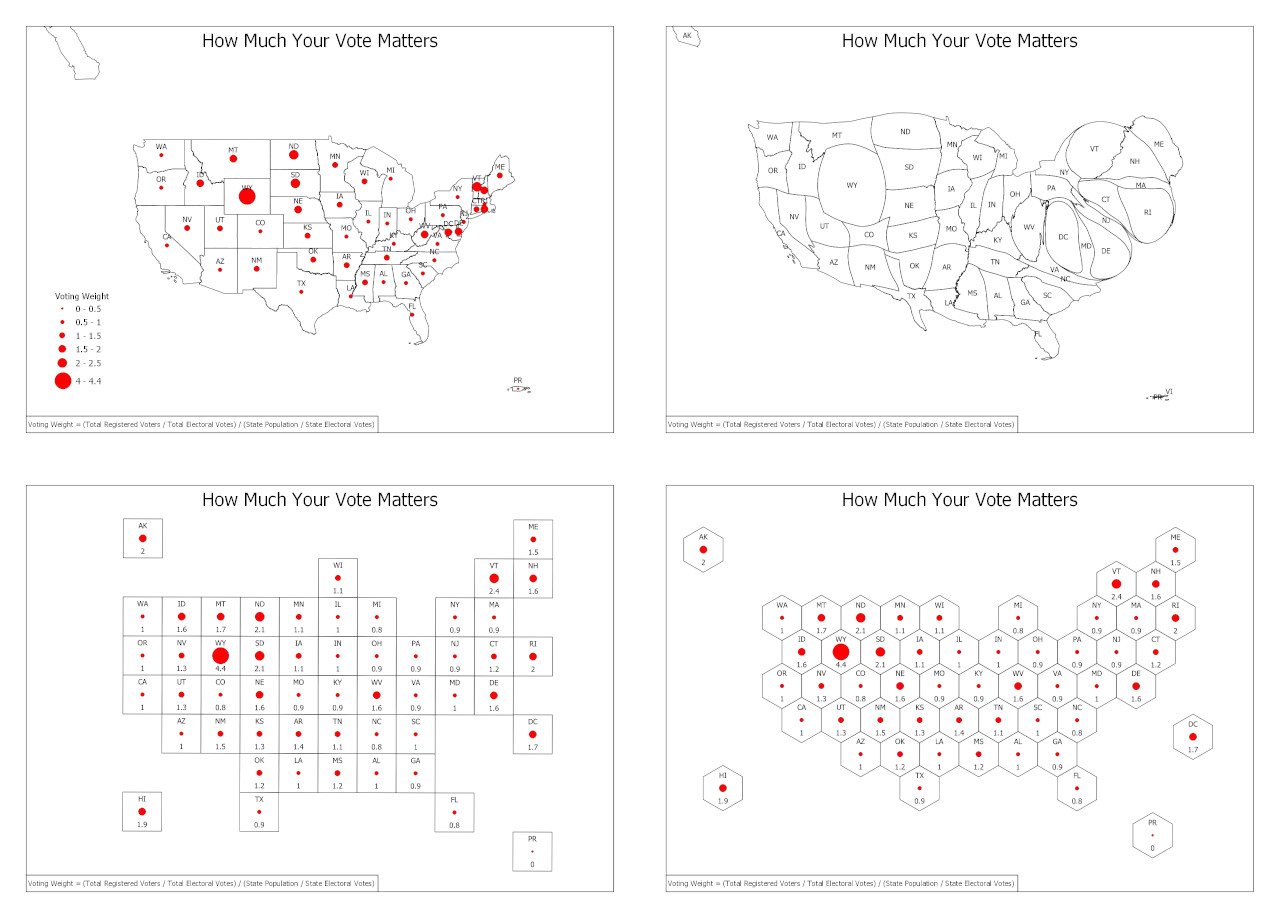
The top left is your standard state map, the top right is a contiguous cartogram, bottom are grid and hex cartograms. Each map provides a unique way of portraying the same data. Cartograms eliminate any geographic bias from the data and give a more accurate representation.
Making the Cartograms
This was the formula I used to calculate the voting weight:
Voting Weight = (Total Registered Voters / Total Electoral Votes) / (State Population / State Electoral Votes)
I used the cartographic boundary files from the Census for the basic and continuous cartogram map:
For the grid and hex cartograms I modified cartogram data sets from ESRI:
To generate the continuous cartogram I joined the voter weight to the census state boundaries layer and used the cartogram3 plugin in QGIS to iterate the weight value with the shape boundaries. States with larger voting weights grew and states with smaller voting weights shrunk.
The source data can be found at my repository here